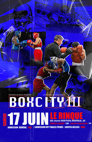
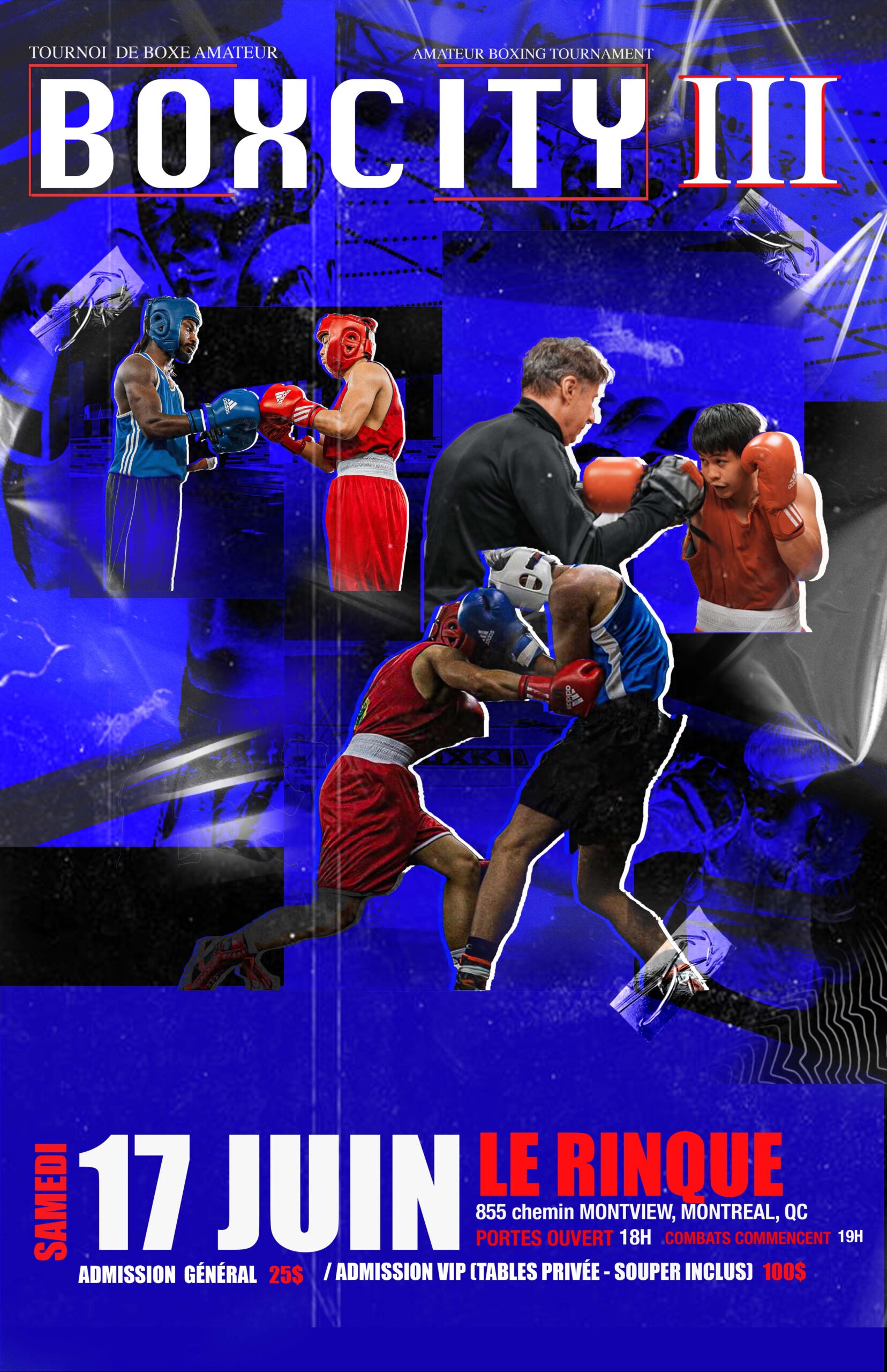
Event poster
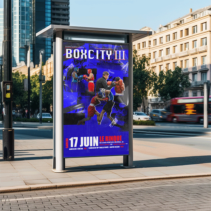
For this project i was assigned to make an event poster of my choice. After considering different options, I decided to design a boxing event poster. The final poster showcases my creative choice and my ability to create a visually striking event advertisement.
For my color palette i selected red, blue and white. I chose red and blue because its the two most common colors in Boxing. These colors also fits the intensity of the sport, Red represents energy and aggression, blue adds balance and contrast and the white helps highlight important details such as the informations and it keep the design clean. Using these colors, i built a dynamic layout and a strong visuals that captures the excitement of a live boxing event.
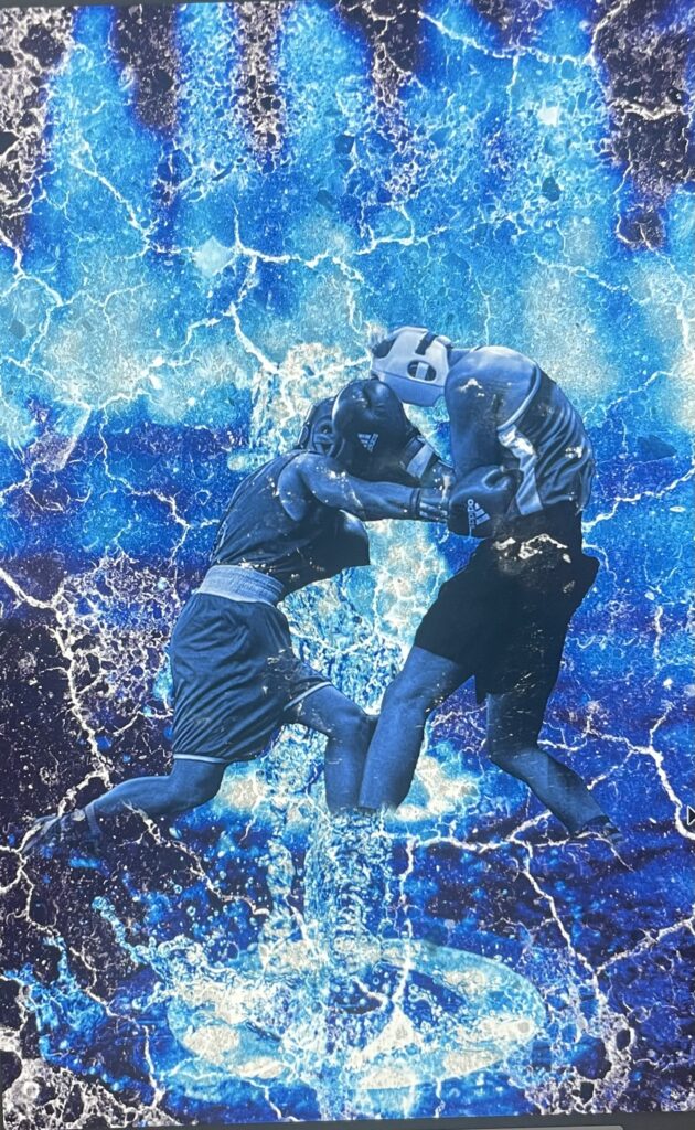
Draft 1 –>
<– Where it started
<– Where it ended
After Brainstorming some ideas, I started working on some ideas. While working on my 1st concept I wanted to have something grunge but when I tried it out I realize that it was too intense and it would just be hard to look at and that it would take away from the informations when I put it in. For my 2nd concept its very similar to my final one except the header for “BoxCity III”, I was debating on which one looks better and I went around asking my colleagues and they preferred the header being up top and I agree with it because it helps you see right away what the name of the event is about and its more eye catching. It also helps you look at the details of the event right after looking at the header without it being on the way and it makes it easier reading the informations.