inkognito
Inkognito was a project for a tattoo brand. When coming up with the name for this tattoo parlor, I was brainstorming clever names that would incorporate what the brand is about, and I ended up with Inkognito. When exploring different names, I wanted to find words that relate back to tattoos. The word that really stuck to me was incognito and I wanted to do a play on words with it, and that’s when I thought of “ink,” so I put those two together because sometimes when people want to get inked up, they want to be low-key about it or have a tattoo that’s subtle.

When brainstorming ideas for Inkognito, I was aiming for something simple and clean. While exploring many different ideas, I first started trying out many different fonts, whether it’s sans-serif, serif, all caps, or all lowercase. The font I went with was something that looked minimal and sharp. While modifying the final font I chose, I came up with many different ideas, such as sharpening the K like a tattoo needle with ink dripping down, but that didn’t really look clean, so I decided to just keep the K as is, which stood out more than how it was before.
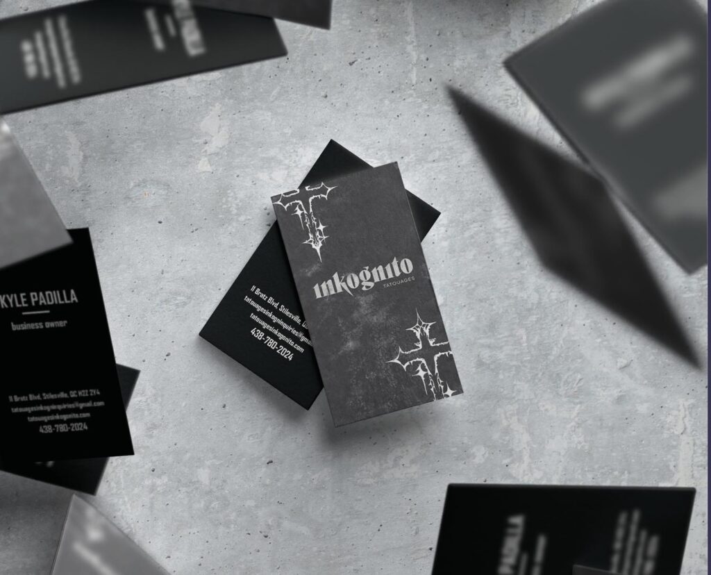
While working on the business card, I had different variations of colors, textures, backgrounds, shapes, and illustrations. Each concept was focusing on that grunge underground feeling I wanted to set for the target audience I want to reach. I had many drafts, such as a red in the front and the inside of a coffin for all the information, but that didn’t work out, so I went back to the drawing board to come up with a simpler design that would still capture the same feeling I was aiming for. The final concept I went with is a simple black and white color with a texture that captures that grunge feeling of when you’re in a tattoo parlor that I was aiming for.