cArs & coffee
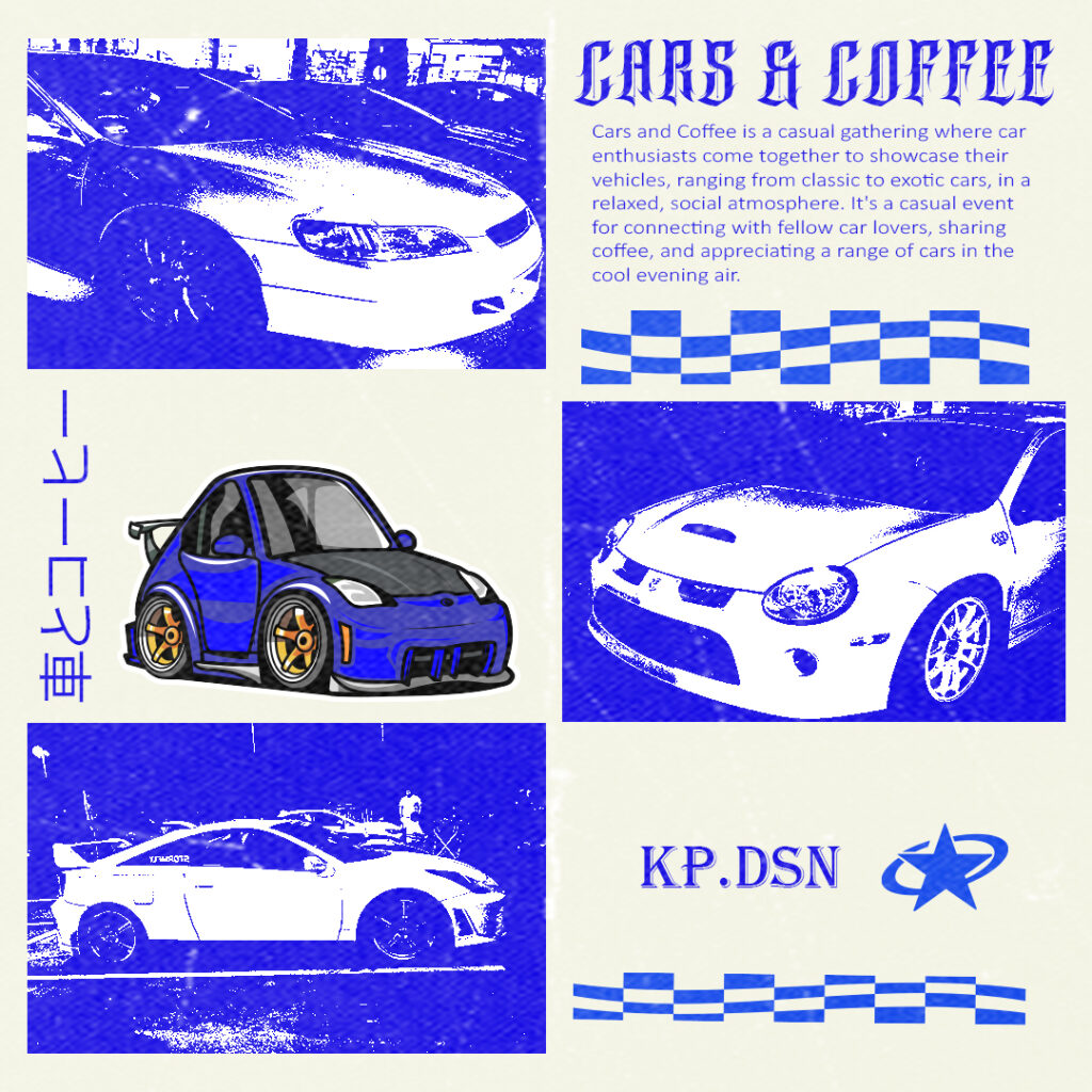
Cars & Coffee is a very popular tradition for people who are into cars, as seen on the poster, it’s a casual gathering where car enthusiasts gather to showcase their vehicles and appreciate other people’s cars. When I am not designing for a school project and a client base project, you will see me at one of these events. When I heard that one of these events was happening near my city, I was quick to grab a camera and go to the event.
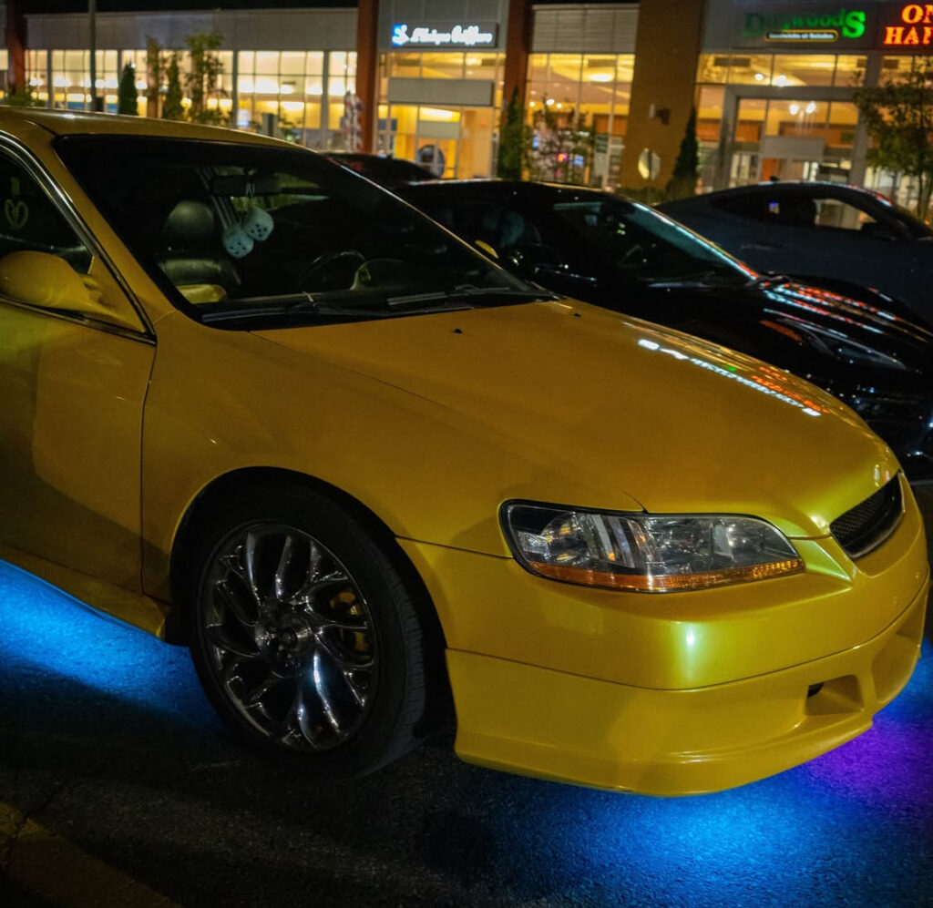
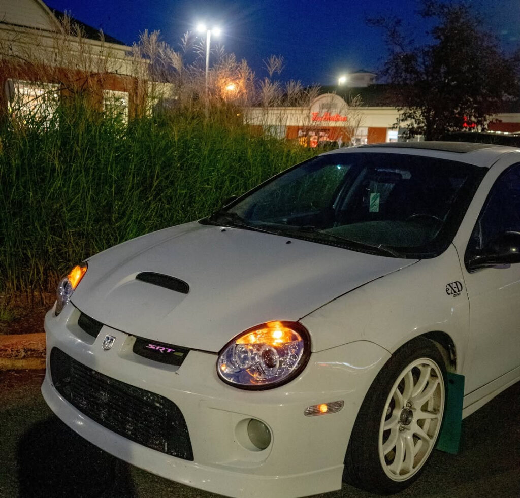
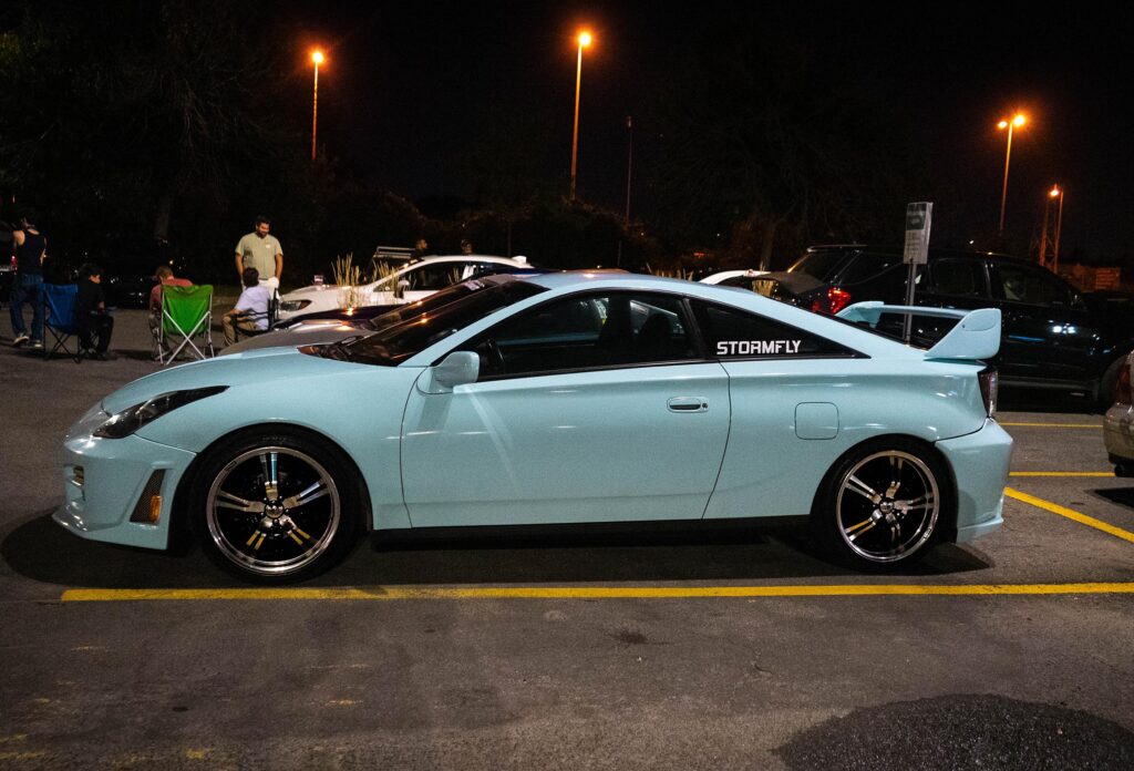
As mentioned before going to this event, I was quick to grab a camera and take a couple of shots. These are the shots I took that’s on the poster of Cars & Coffee. While taking many different shots, I was trying out many different angles, and these were my favorite photos to include in the poster.
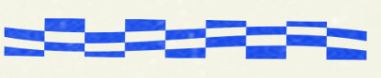

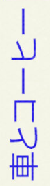
While thinking of ideas for making a poster for this event, I wanted to make a poster that fits the vibes of a car enthusiast and that consists of a grunge vibe, a street style aesthetic, and a racing aesthetic. When coming up with ideas on how to incorporate something grunge into my poster, I was thinking of making the photographs themselves and turning them into a grunge feel. I did that by using the threshold tool to have that effect with the feeling I was going for. When aiming for that street aesthetic, I was thinking about elements I can add to my poster, and doing that, I added some Y2K elements such as the star, and I also added a racing element to aim for that racing aesthetic as well. I also included some Japanese lettering that translates to “Cars and Coffee” because car meets and gatherings like this are very popular in Japan.
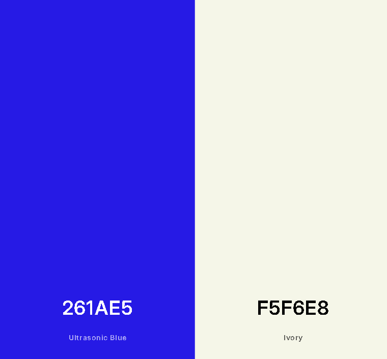
For my color palettes, I went for a blue color because it’s a color that is a very popular car color and has a strong historical link to car racing (e.g., Subaru Rally has a lot of blue cars); this color resonates well with the car scene. I chose a beige color as the background because it contrasts with the blue that was chosen; the beige makes the blue text easy to read, but it also grabs your attention immediately.